


Q&A - The Maloja Pushbikers' Sum, not your ordinary team bike design
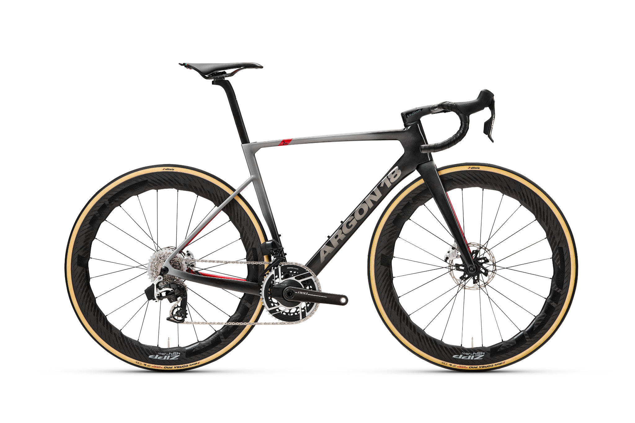
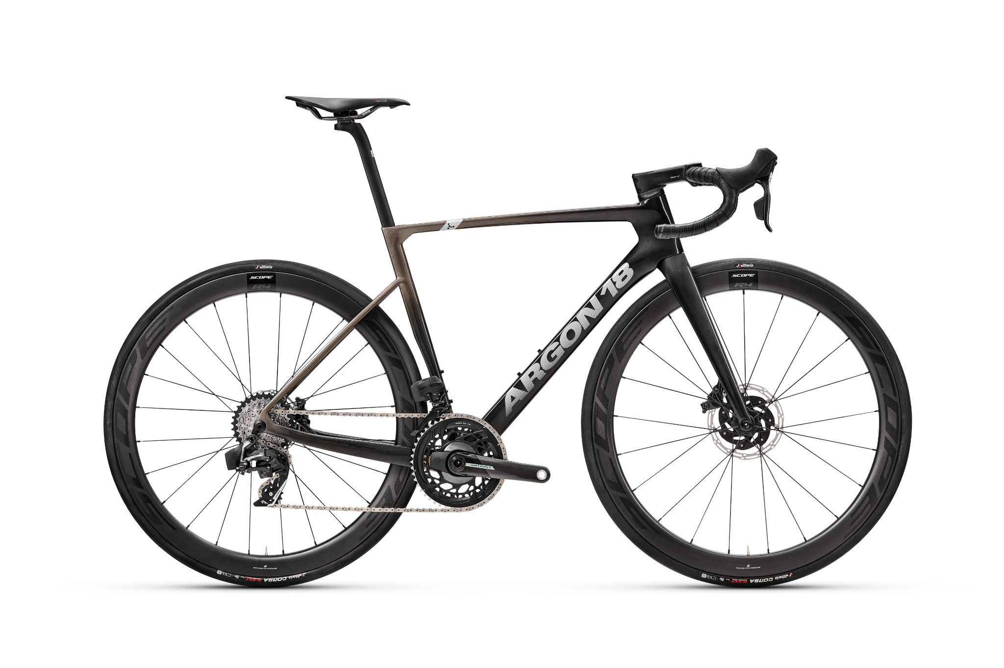
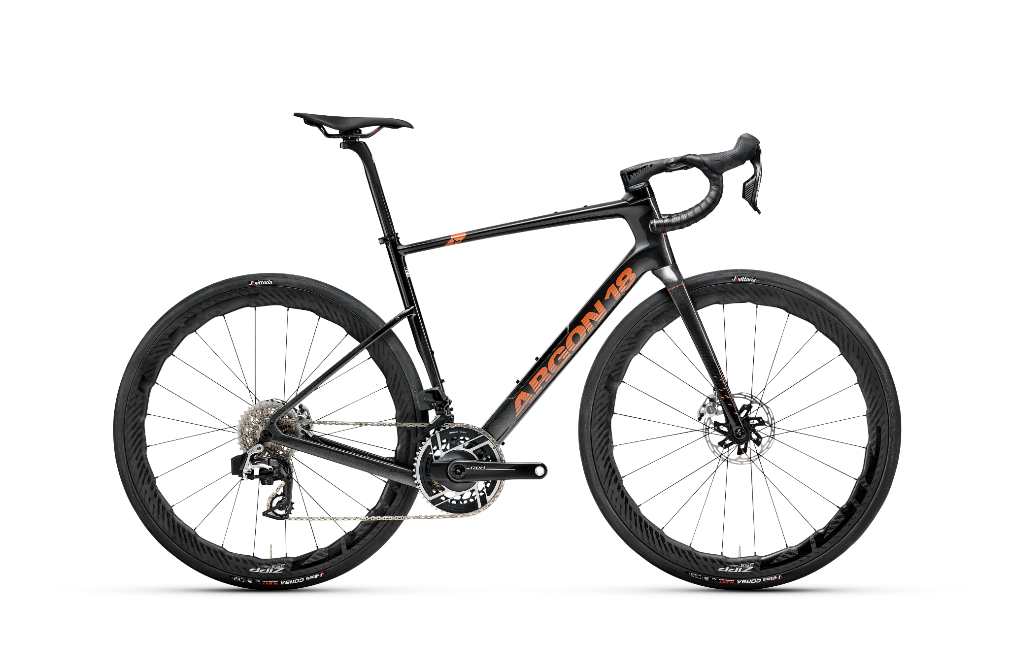
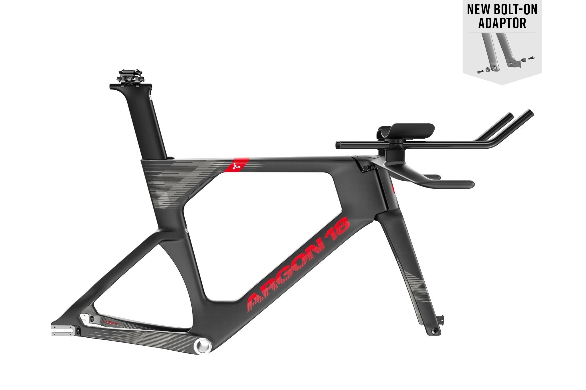
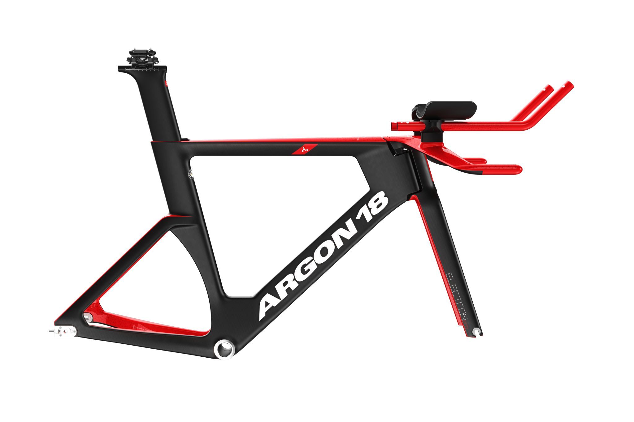
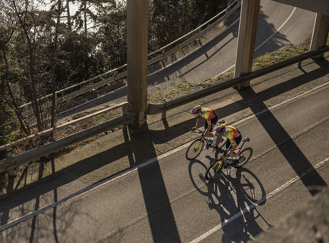
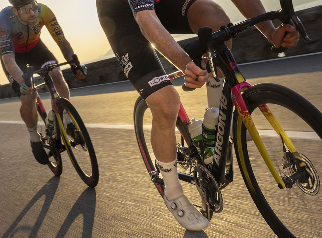
The Maloja Pushbikers will be riding the Argon 18 Sum for 2024, as we kick off our three-year partnership with the UCI Continental team. The Pushbikers are well known for their unique and flamboyant personalities (and kits), so it was quite the design challenge to create custom artwork that lived up to that reputation. We spoke with Argon 18 graphic artists Sam Clairoux and Kim Sivert about the design process.
Argon 18: What about the Pushbikers team inspired you most during the design process?
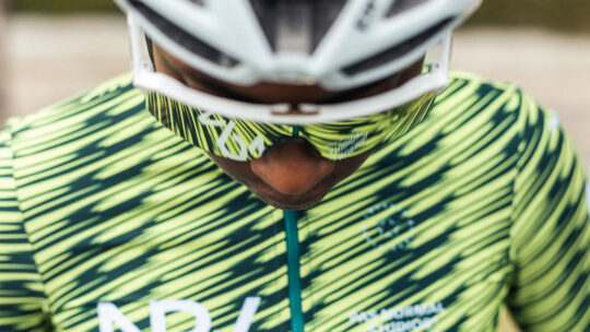
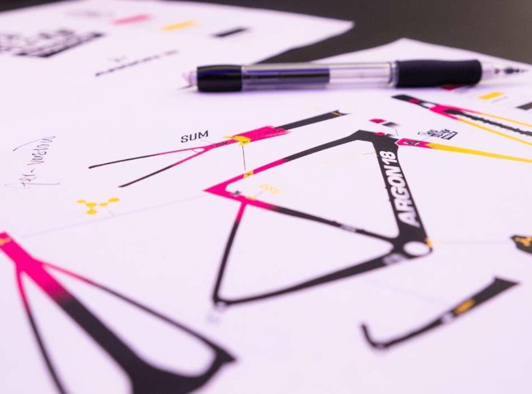
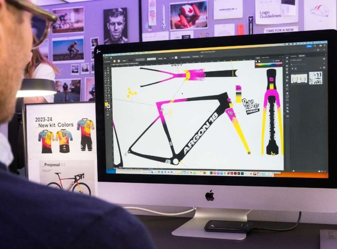
Sam: Kim and I went back and forth on design ideas and how we could make a statement with the design of the bike. We wanted a final product that would reflect the Pushbikers’ wild imagination and match their kit, which is pretty wild as well. The most interesting aspect about the Pushbikers team as a whole is their willingness to be different - but different in a meaningful way. They are constantly looking for new angles to make them stand out from the pack, and that says something about the team. This year, they achieved that with their upcycling project: the team picked up trash along their daily commute, and that inspired the design of the new kit - the logo, colours and textures. It’s all about the community and who they are as individuals. The bike had to reflect that.

“We wanted a final product that would reflect the Pushbikers’ wild imagination and match their kit, which is pretty wild as well,”
- Sam Clairoux, Graphic Designer at Argon 18
Kim: The Pushbikers have wild and different ways of expressing themselves compared to what you typically see in the cycling scene. That means we had to deviate from a classic expression in the design language.
A18: What parts of the Pushbikers’ team ‘personality’ do you think really came through in this design?
Sam: I think the design is just an extension of who they are. The Pushbikers’ sense of community is strong and a design like this certainly brings the community together, whether you like the design or not! After all, they are not your regular UCI Continental team, it’s the Pushbikers!
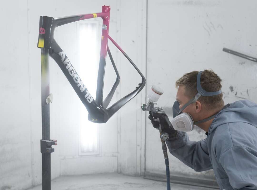
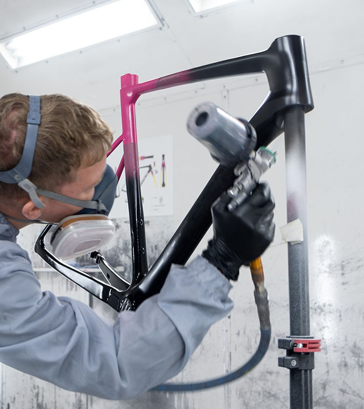
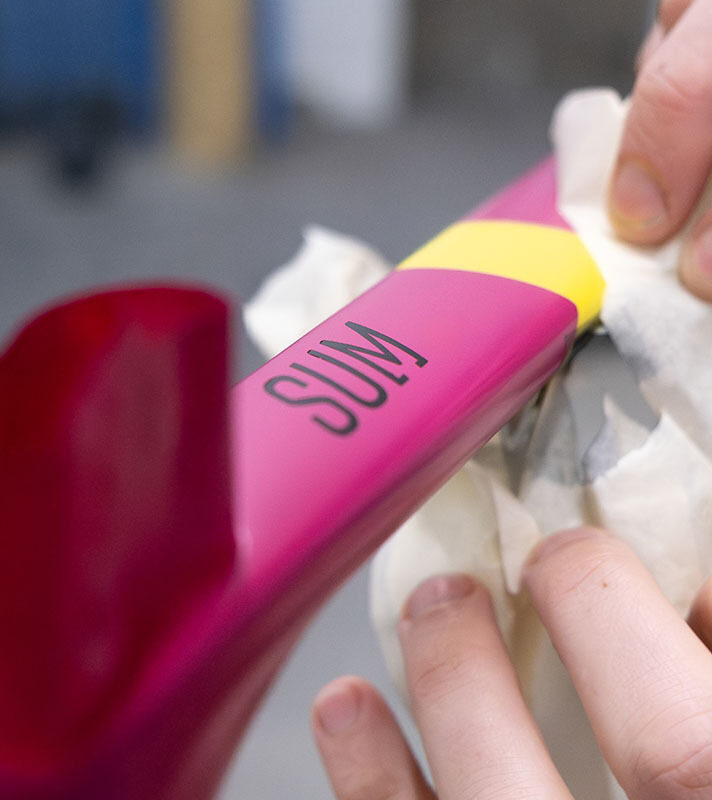
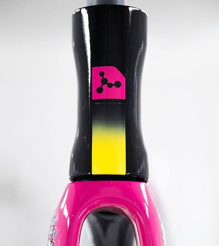
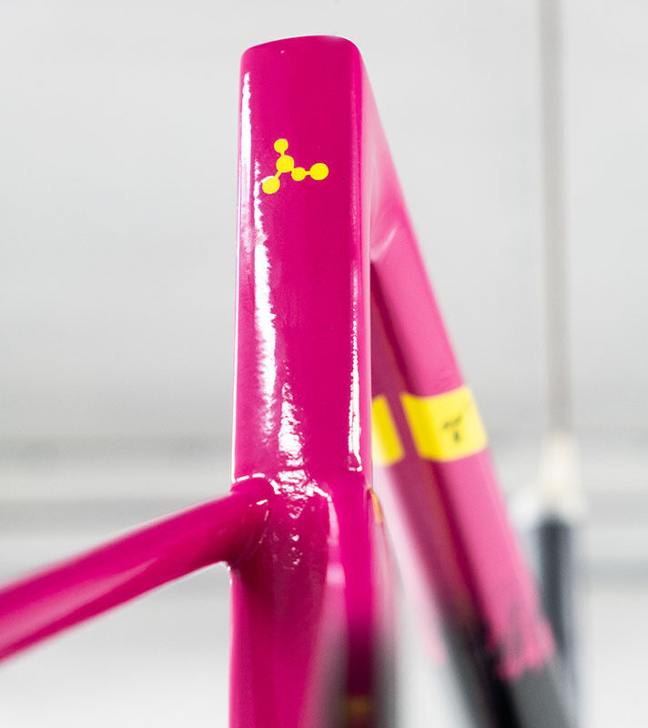
Kim: The Pushbikers' kit this year is actually a bit more controlled compared to what we saw last season. The jersey design features a gradient, transitioning from blue to yellow and ending in pink. On top of this, there are layers of wide brush strokes. Integrating these brush strokes into the bike design was an essential element.

A18: What was the biggest challenge of the design process?
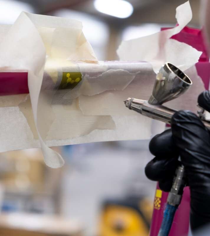
Sam: The fine line between too much and not enough, visually, for this project was a little bit tricky. With the team’s wild textures and colours, we had to deliver a bike with just the right amount of craziness and refinement. So, there were quite a few concepts that didn’t made the final cut simply because the balance was not quite right.
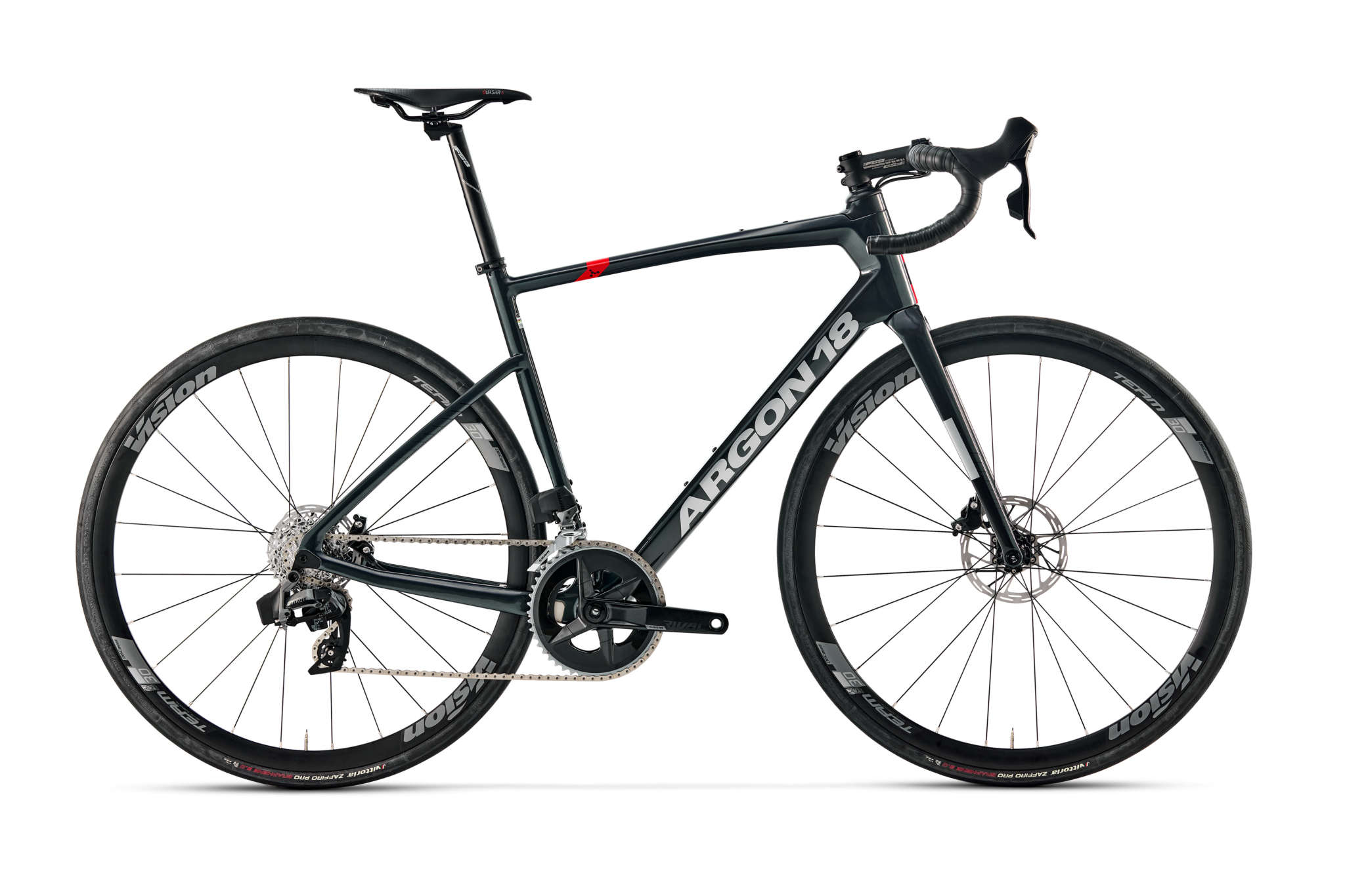
Kim: At first we wanted to create a white bike, since it's not very common in the Pro and World Tour scenes, which would make the bike stand out. However, in the end, the team thought it would be too much of an extra challenge to keep white bikes clean and presentable throughout the season. One challenge has actually been working with Reynolds, the wheel supplier for the team, to create a design on the wheelset that is complementary to the bike design – and not too loud!

A18: What special features or details in the final design would you like to highlight? Any hidden secrets we may not notice on first view?
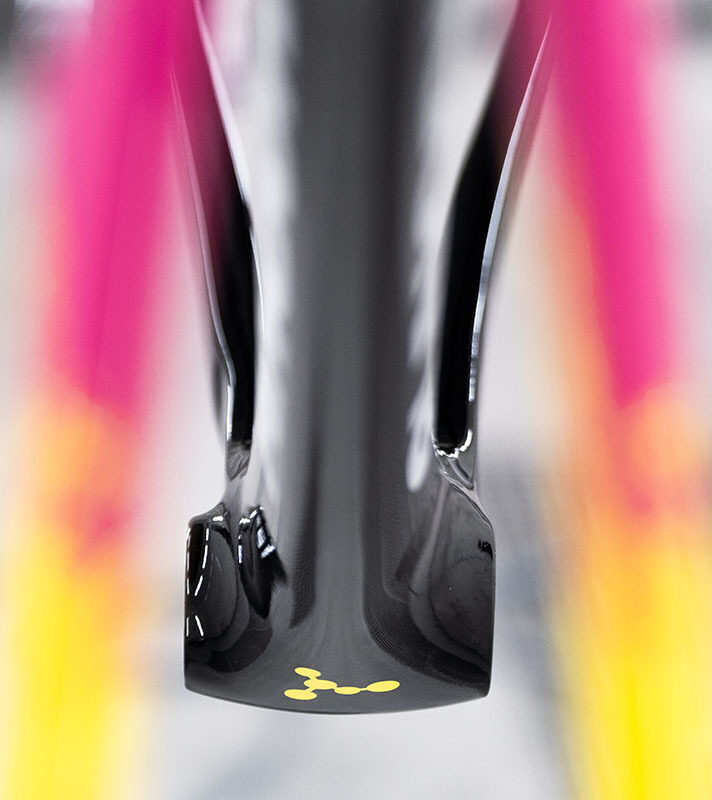
Sam: The texture fading in and out of the base paint was, on its own, quite something to achieve technically. That in itself is quite remarkable. There also might be a hidden mathematical challenge for you on the frame if you’re up to it…
I also think the design reflects just how much Argon 18 has evolved in the past few years. We are willing to push the boundaries in the bike industry while maintaining a strong and recognisable brand, even in a design project like this one.
Kim: I like the somewhat street-inspired design the bike has taken on, while still maintaining balance in the overall design. And it was quite easy to integrate Argon 18’s consistent design elements, so the bike is recognisably an Argon in the end.

“I like the somewhat street-inspired design the bike has taken on, while still maintaining balance in the overall design,”
- Kim Sivert, Graphic Designer at Argon 18