


Welcome to 2021! Go Behind the Scenes With Our New Fall Colours
One of the most noticeable things about Argon 18’s 2021 lineup is striking new colours and artwork. We spoke with Art Director Alex Saint-Jalm to get some insight into the colours of 2021.
Almost every model has a new look this season. Why the change?
Artwork on a bike can be really simple: you often see brands using a signature colour and logo positioning season after season because it’s recognizable and people respond to it. Truth is, that would make my job easier! But with Argon 18’s efforts to push the limits of design and layup, I think that artwork can be part of that effort as well.
What’s the process behind developing new artwork?
Every time we work on new artwork, it’s not an easy task. It’s always about finding the right balance: you want to do something unique, but also not go too far. So it’s a fairly long process for every collection. We start with research, studying all the new trends both inside and outside the cycling world. I’m totally obsessed right now with car paints, I’m also following a lot of artists - it’s good to know what’s happening outside of your immediate world, and feel that influence.
After the research phase, we create moodboards, and try to identify what consumers will be looking for in the next few years. From here we create concepts. Projects are started almost two years in advance, and I have a final version of the bike one year before it hits stores. So it’s not totally uncommon to see another brand realizing a new bike with some shared visual elements, since you’re drawing on the same trends through that time period. Sometimes we see this as a validation - but at the same time, it can be frustrating!


Tell us about the specific influences on the 2021 bikes.
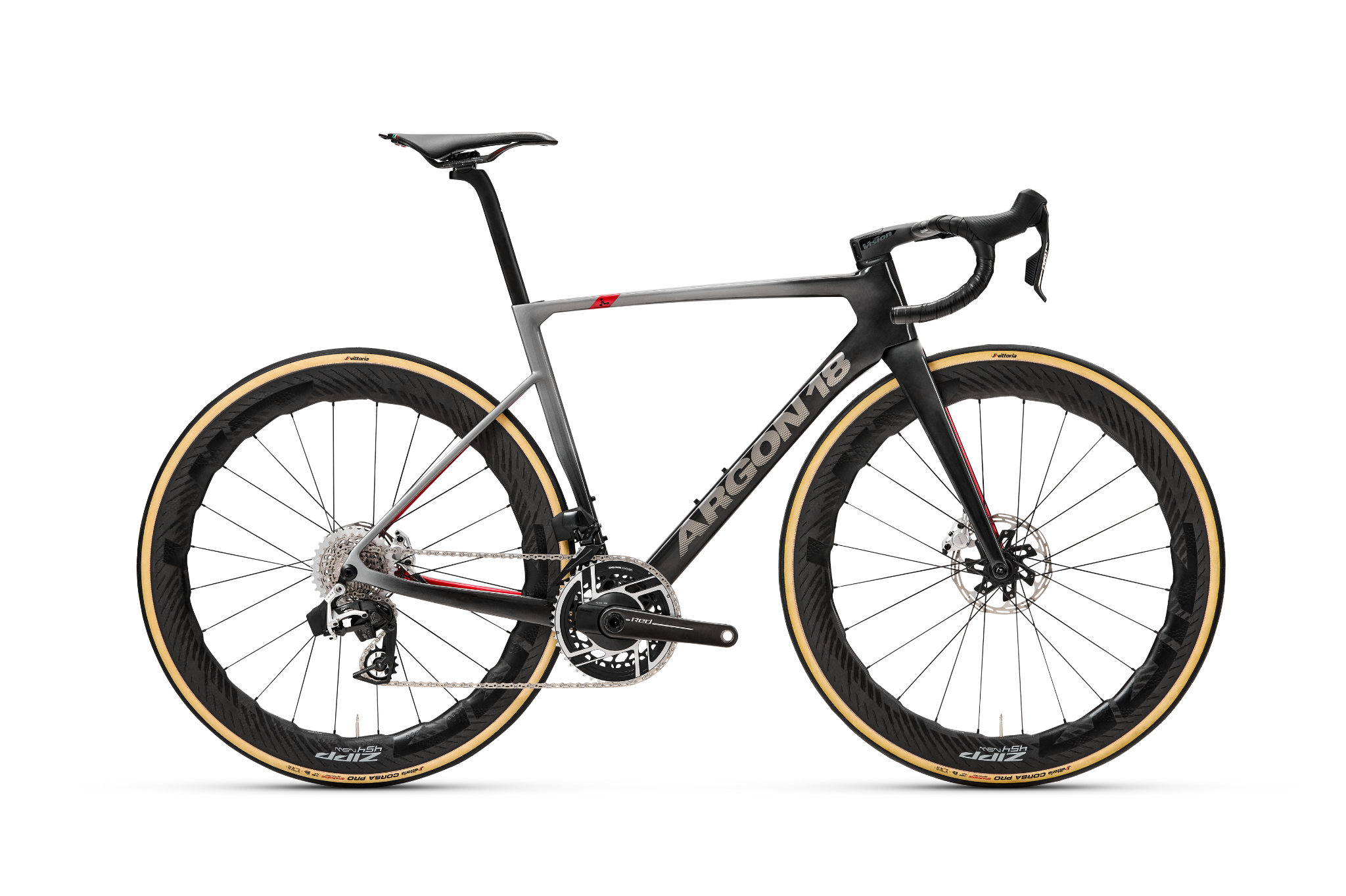
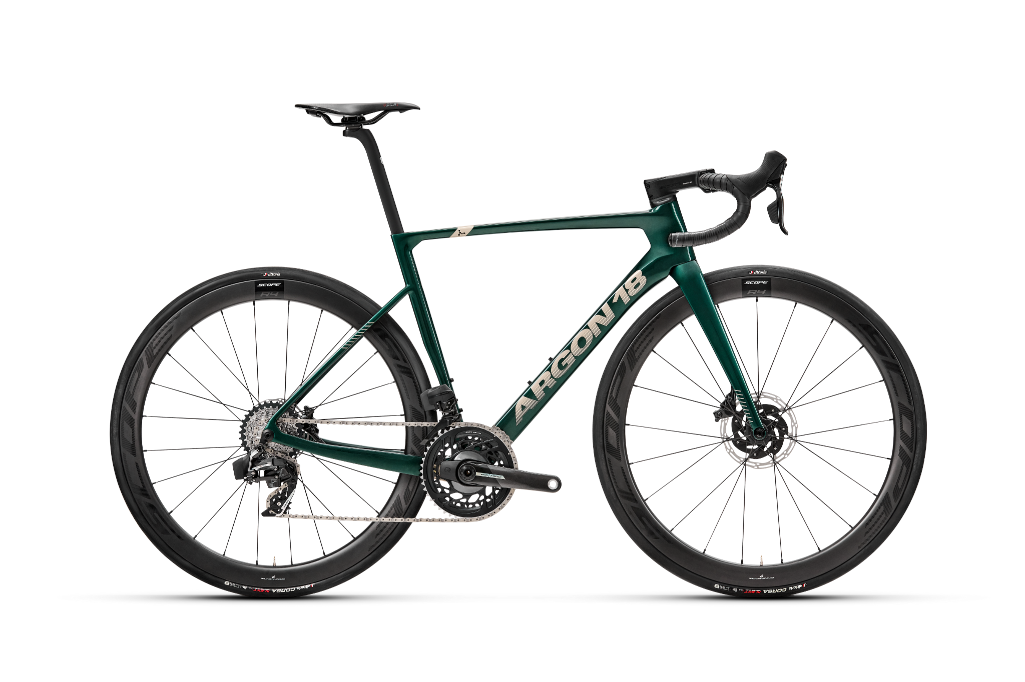
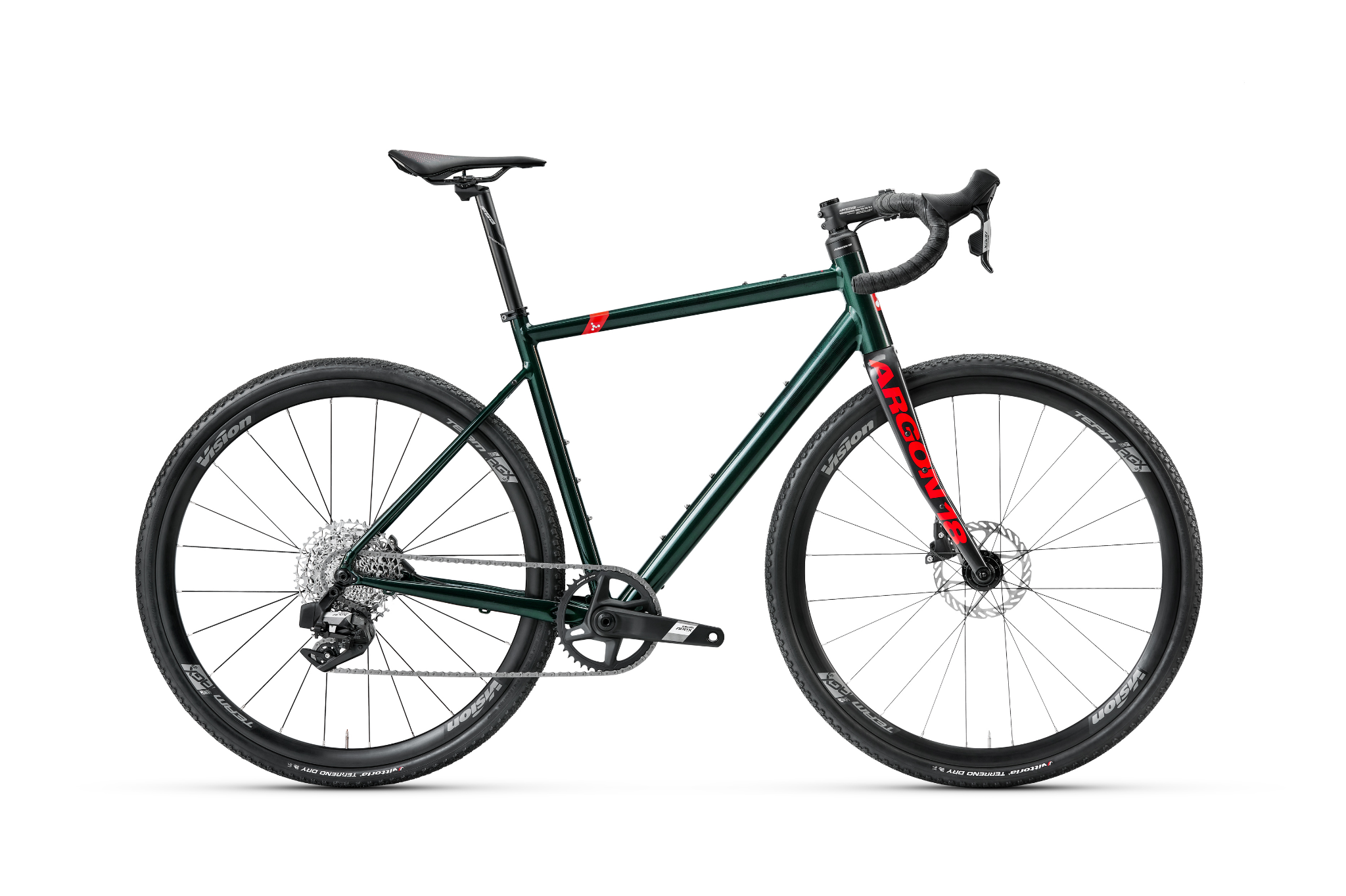
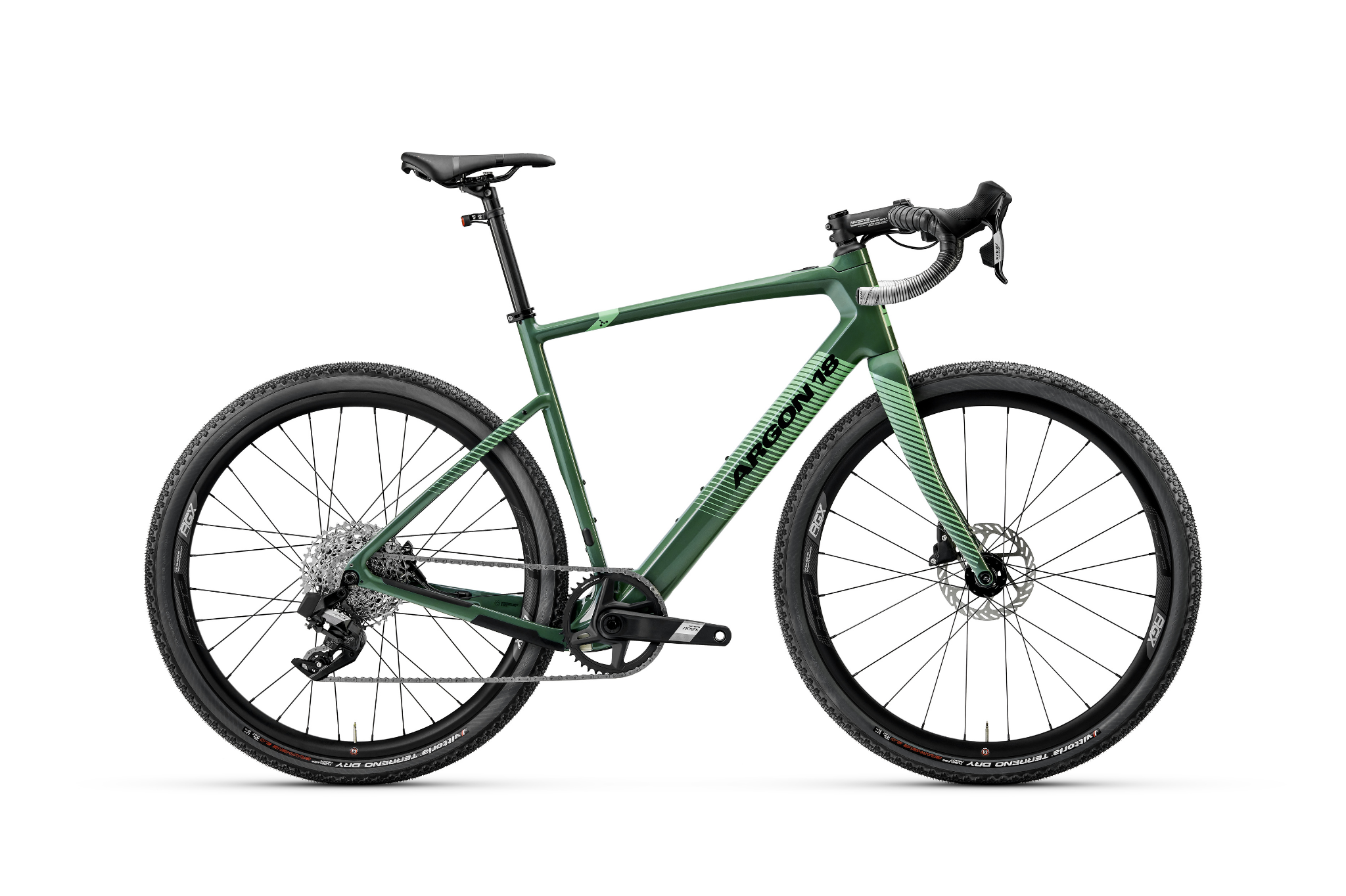
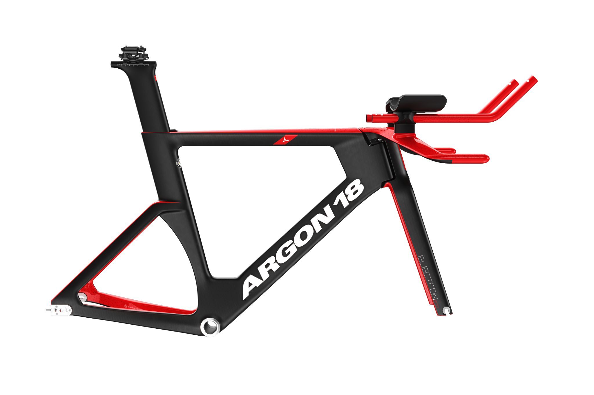
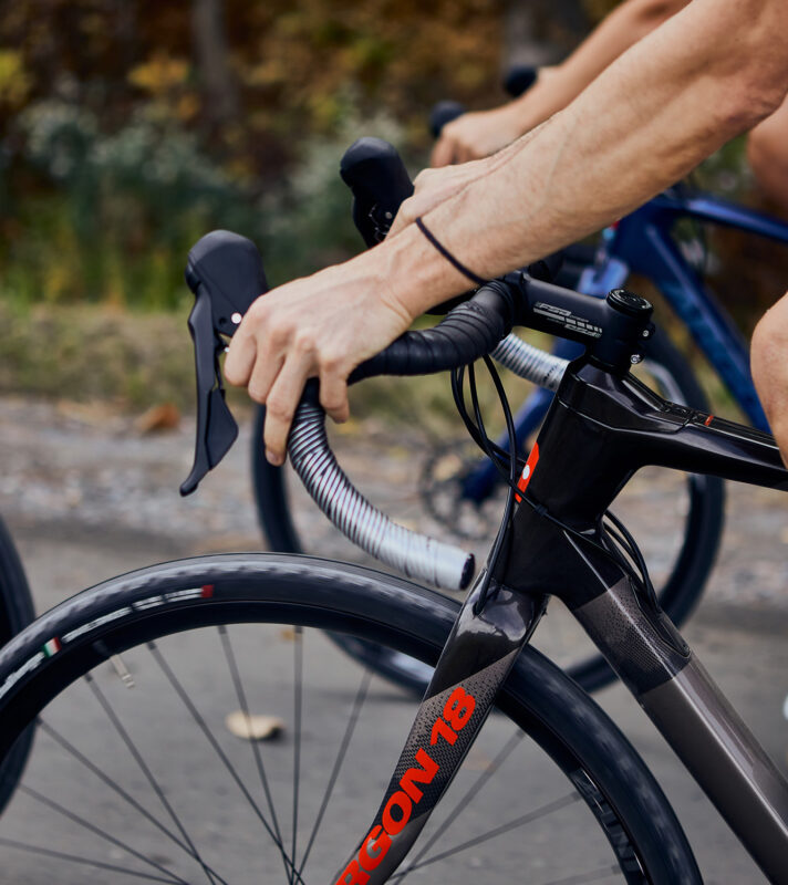
This new collection reflects several new initiatives. Over the past few years we’ve been developing custom bikes for Astana Pro Team and our pro triathletes, which allows us to try out new concepts and get some feedback. Actually, the bike we did for Miguel Angel Lopez for la Vuelta in 2018 featured a colourshift, something you see in several of the 2021 bikes. The new Gallium Disc colorway is almost a replica of that bike, and expresses my strong desire to offer the look of a custom bike to the public - without breaking the bank.
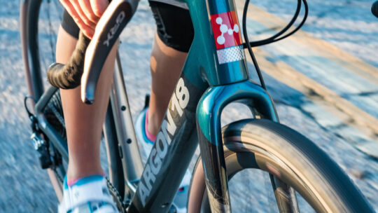
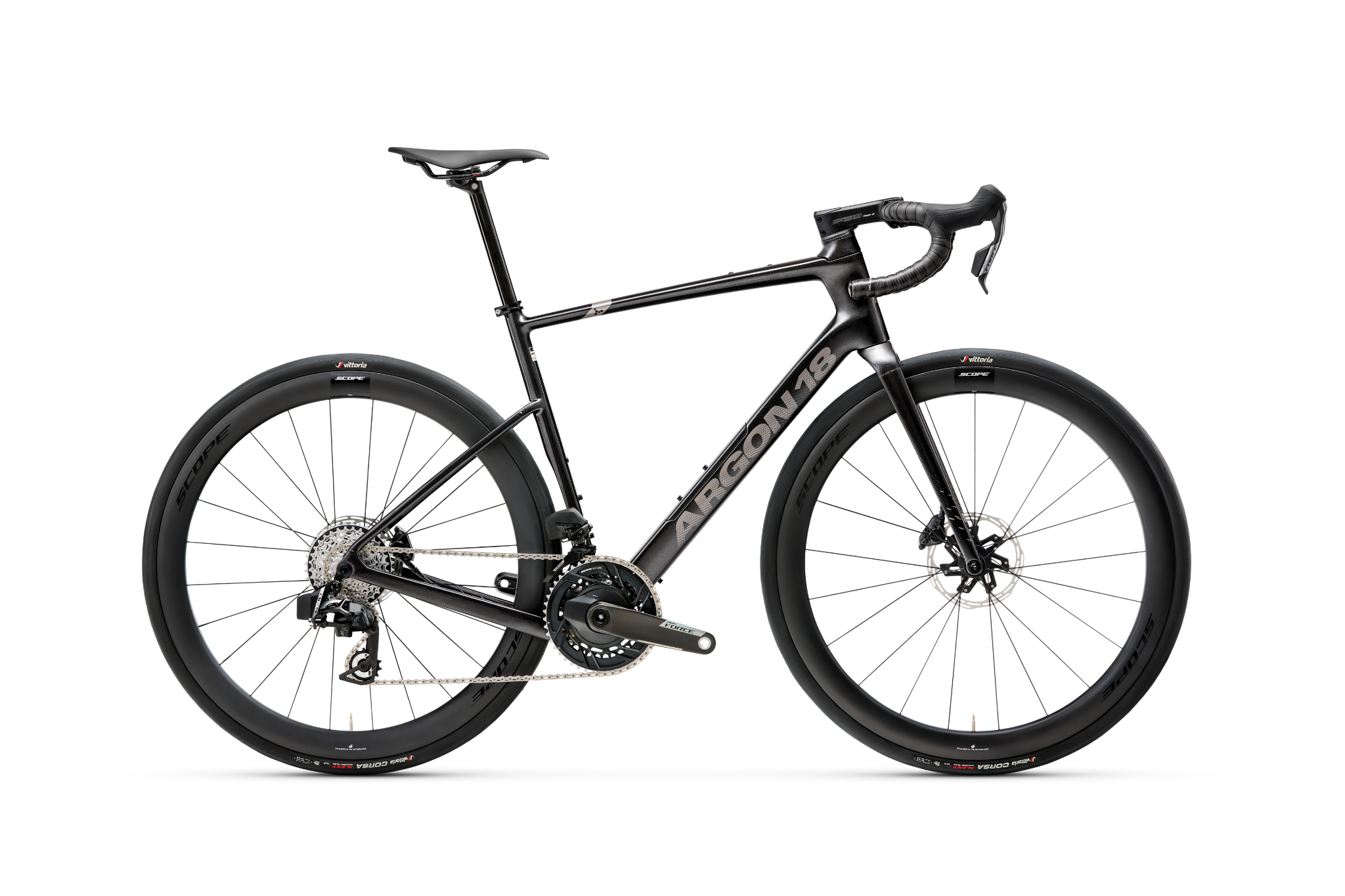
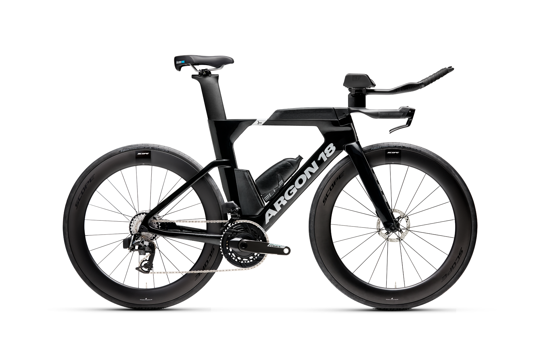
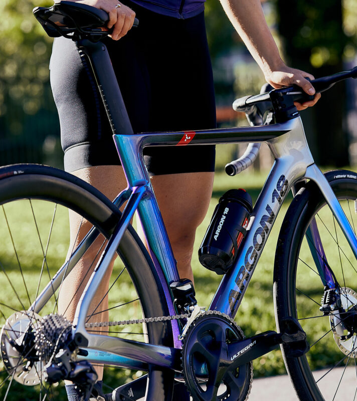
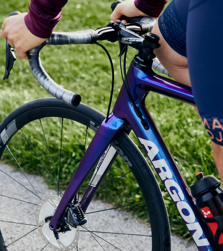
The collection was imagined with two strong pillars: one is a tribute to more traditional colors like silver and black, and the second one is offering designs closer to some recent graphic trends that you find in other fields. If you take the Gallium Pro Disc, the bike can look simple, but the paint is actually a really interesting candy blue. It’s a strong colour, but you can still see the carbon fiber through the paint. In changing light conditions, the fibers become more visible, so the bike is like a moving image. The colourshift on the Nitrogen Disc has the same type of effect. I love the idea of that moving image, that you’re rediscovering your bike on every ride.
When you see strong new trends, you’ll generally see a counter-reaction a few years later. Not so long ago, bikes were graphically loaded, so it’s normal to see simpler artwork on bikes now. I’m a big believer that small things make the difference, so our bikes have several small hidden details that you won’t see until you’re up close. For example, every bike has a mathematical formula that expresses what the bike is designed for – aero efficiency, for one. Also, there is a hidden message on every bike. It’s becoming a bit of a game now - my colleagues and bike shops are already developing the habit of searching for the message.

Is this a major shift in Argon 18’s aesthetic?
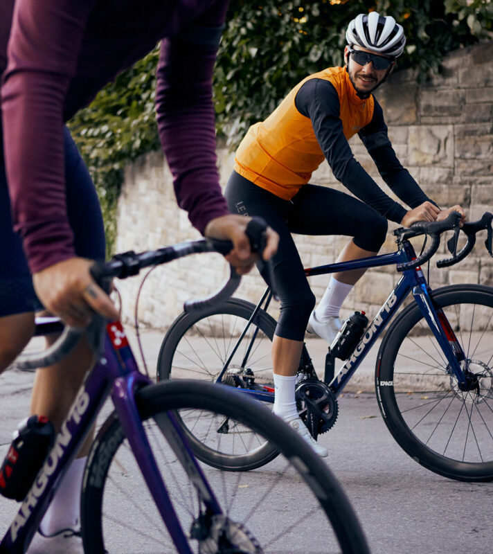
Argon 18 has been recognized for a unique aesthetic in the past. You can’t say anything against black and red bikes - they are instantly associated with racing. And with the molecule logo, Argon 18 has really developed a strong visual language. I’m highly aware that Argon 18 has built something distinctive and people are really attached to it. But it was also clear that we needed to offer more options. The perception of different colours is really personal, and it’s also influenced by cultural traditions, so as we grow globally we want to be sure to resonate with a great diversity of riders.
Photos by Julien Payette-Tessier